Explore the highlights from Apteco's Q2 2022 software release
Find out how we're making it even easier for marketers to analyse key metrics with calculated measures in Apteco Orbit™ dashboards, discover how we've extended our drive time functionality in Apteco FastStats® and how we've built on to our WhatsApp integration by adding preview and testing capabilities. To read the full release notes our partners and users can login to the Apteco portal
Need help? For a practical, step-by-step guide on how to use any of the features in Apteco software, visit the Apteco help hub.
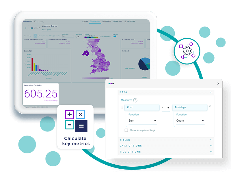
Calculated measures in Apteco Orbit dashboards allows you to easily display headline figures and keep track of key stats by simply adding, subtracting, multiplying or dividing data to present key marketing metrics as ratios.
By selecting a category colour for your variables, you can ensure that your visualisations are consistent and coherent. Choose specific colours for brands, products, regions or any other selector category you like.
We have simplified our dashboard tile UI by organising tile options within a single accessible and navigable menu, created a new 'Save as PDF' button and dashboard charts can now display a percentage above the main chart colour indicator bars.
This new method of calculating drivetime using the Bing Isochrone API, can return more complex shapes, more quickly, with more accurate results.
The latest developments to the behavioural modelling feature in Apteco FastStats allow you to easily identify and select the best features to use in a data model.
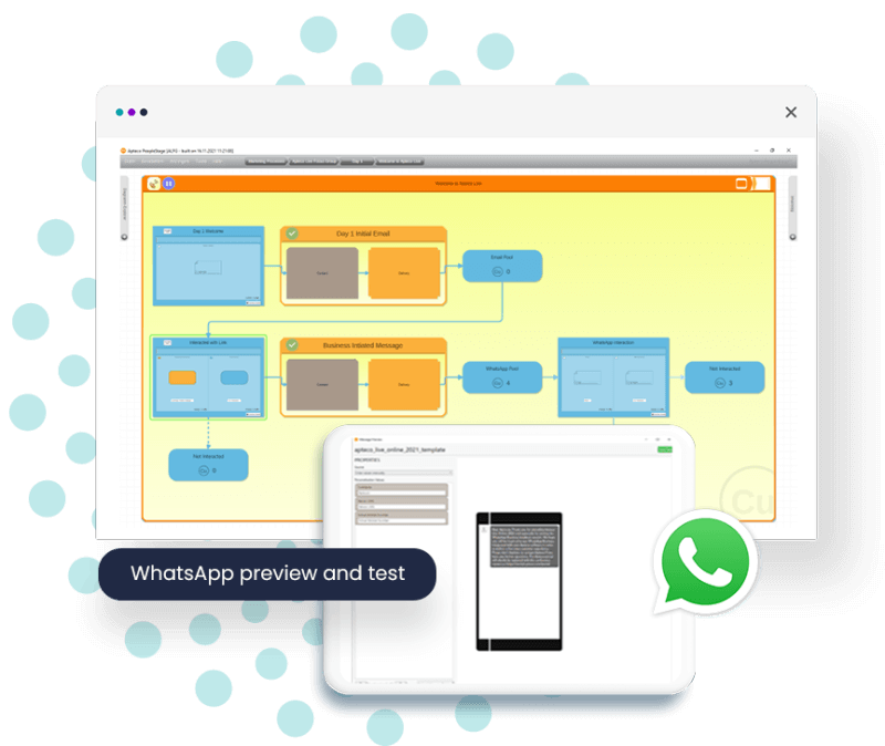
You can now preview and test within the delivery step of our WhatsApp integration. This function allows you to view a preview of the text in your message and to send a test to yourself.
Login to the Apteco portal to download the full technical release notes document
Easily calculate marketing outcomes with calculated measures
One of the most important parts of designing an effective dashboard is ensuring that you have selected the right metrics and KPIs to display.
Apteco Orbit's new calculated measures feature gives dashboard creators and editors the ability to calculate their own measures using simple summations. Calculated measures comprises of simple operators to allow you to add, subtract, multiply and divide data variables and / or full counts of system tables together, and display the result as a single number tile, or any other visualisation. Calculate click-through-rates, average transactions per customer/ product / brand, response rates and much more, to clearly display your most important metrics and KPIs on your dashboard.
-
Quickly and easily perform powerful calculations. Simply add, subtract, multiply, or divide by selecting operations from a drop-down menu
-
Identify trends more easily. Display key marketing metrics like click-through-rate, response rates or averages on a single number tile in order to keep track of marketing outcomes
-
Democratise your data. No need to define, create, or adjust data tables. Apteco dashboards will do the hard work for you

Category colours in Apteco Orbit dashboards
The introduction of category colours in Apteco Orbit dashboards allows you to set specific colours for brands, products, regions or any other selector category you like, providing consistency and helping with instant recognition to facilitate quick decision making.
For example, if you were creating an election dashboard, you could choose to use colours associated with the political groups to clarify and give context, or if you were comparing how one product is performing against another, you could use brand colours to make it instantly apparent which product is being referred to.
- Colours are allocated to variable categories as they appear in your FastStats system
- You can search for a variable or a specific category in the category colours section, within the application settings
- Simply select the variables you want to set the colour of, and enter a hex colour value, e.g. #00A5AA

Apteco Orbit usability
A number of enhancements have been made in Apteco Orbit dashboards to improve the user experience. These include:
Save to PDF
You can now export your dashboard to PDF using the 'Save as PDF' button. This function allows you to create a pdf of your entire dashboard which you can then conveniently save locally, print, include in a report or share with your colleagues.
Tile layout improvements
Tile options have been consolidated under a single ellipses drop down button. This aims to keep dashboard tiles uncluttered and opens up more space for visualisations.
Chart Percentages
Now, by choosing 'show values as percentages', from the data label settings on compatible dashboard charts, you can display the percentage value for greater insight on the breakdown of category results.

Extended DriveTime calculation options in Apteco FastStats map tool
Looking at catchment areas and identifying drivetimes, for example, the distance from a store, the nearest airport, or perhaps a live event, can be a useful marketing tool. The Map tool in Apteco FastStats provides various ways to select people geographically, including a number of options for calculating drivetimes.
The drivetime capability in the FastStats map tool has now been extended so that you can choose to calculate drivetimes using the Bing Isochrone API. With no fixed number of endpoints, the new method can return more complex shapes and, consequently, more accurate results, often more quickly.
- Travel types also include options for walking and public transport
- Because this method does not have a fixed number of endpoints (typically the resulting shape has between 500-800 vertices, depending on the complexity of the road network and the drivetime time or distance set), the drivetime results are much more accurate
- The public transport option assumes that you are leaving the centre point at the current time; the shapes generated are dependent upon, and vary according to, the time of day that you carry out your drivetime analysis

Identifying the best behavioural features to use in a model in Apteco FastStats
The value of behavioural modelling lies in the ability to identify patterns with distinctive differences between the analysis and base selections, where these patterns are consistent with other time periods. However, there are other cases where the pattern observed over one time period does not apply to other periods - due to external differences or because a feature is too niche. In this release the behavioural modelling functionality has been enhanced in order to help you identify the best behavioural features to include in a model.
A selection of new charts, with a combined training and evaluation option, allow you to compare training and evaluation periods simultaneously. A new metric – Uplift PWE – provides an alternative to the power metric and allows you to investigate niche features which may only apply to a small subset of your customer base, but still provide a strong indication of a good prospect.

WhatsApp preview and test in Apteco PeopleStage
In collaboration with Syniverse, you can now preview and test your messages within the delivery step to check that your message is as you'd expect it before you publish your message.
- This function allows you to check if your message name is recognised before publishing
- The preview and test button opens a screen where you can view a preview of the text in your message
- You can also send a test message to yourself to check everything works correctly
- Utilise preview and test functionality before you publish to ensure that the message is delivered as expected

Take a look at the previous Apteco software release highlights
Latest Apteco Orbit updates
Apteco has released 6 updates to the Orbit platform (versions 1.10.23 to 1.10.27) since the Q4 2021 release. Visit the Apteco help hub to find out about what's new in the Orbit platform.
Q1 2022 release highlights
Uncover our brand new integration with WhatsApp, discover three new ways to filter your dashboards and unearth the benefits of our segmentation migration reporting enhancements.
Q4 2021 release highlights
Find out about Orbit Venns, new features and enhanced UI of behavioural modelling in FastStats and a major enhancement to our real-time campaigning functionality in PeopleStage.
Q3 2021 release highlights
Discover how we're making Apteco software even more efficient with dynamic solutions to automate processes, tools to help you organise your resources and search functionality for extra precision.

